
Reducing and restraining colour, to make more effective and coherent images.
I’ve been working mostly in monochrome over the past few months, which makes this article a good excuse to return to thinking about colour and what it actually does in a photograph.
Without colour, the frame has to rely on other elements – think line, point, shape, form, value, texture, space. Colour introduces another layer of organisation. It can separate elements that would otherwise merge, or connect parts of the frame that have no obvious relationship. A block of colour can carry as much weight as a line or a form, so it warrants the same level of care as any other element of composition.
-
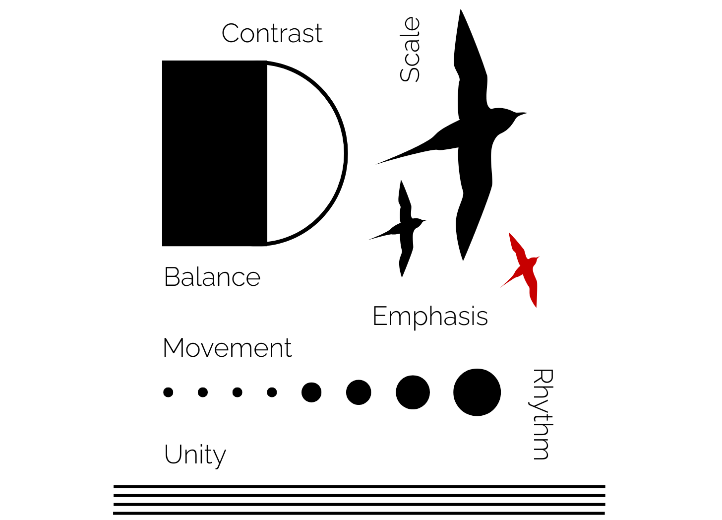
Building Art, from Elements and Principles
Understanding the elements and principles of design as a basis for all visual arts.
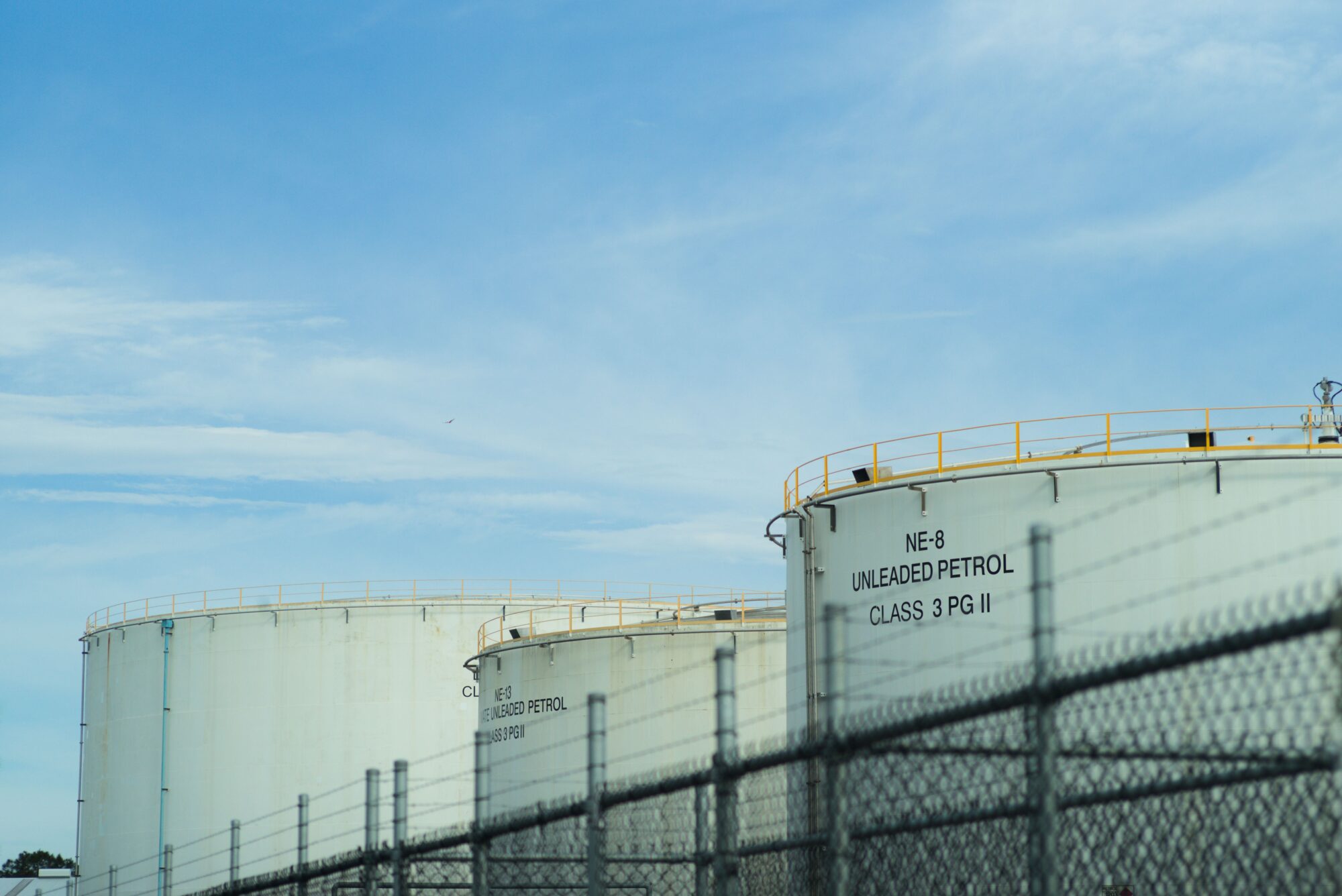
Practically, colour is one of the most adjustable aspects of a digital image. With tools like Lightroom (or my preference, Darktable) colours can easily be shifted, corrected, or removed entirely. I generally choose not to see colour while I’m shooting – my Leica M240 is set up to produce a monochrome JPEG preview, even though the sensor records a colour RAW file. Colour is something I deal with later, if at all.
Although it might seem counter-intuitive, working this way has allowed me to consider colour more deliberately.
What has become clear is this;
The most successful images tend to place clear limits on colour. It is very easy to have too much.
Strong colour photographs narrow the palette. By limiting the number of colours present, relationships between them become more legible. Repetition, contrast, and balance begin to emerge. Without this restraint, colour competes rather than contributes.
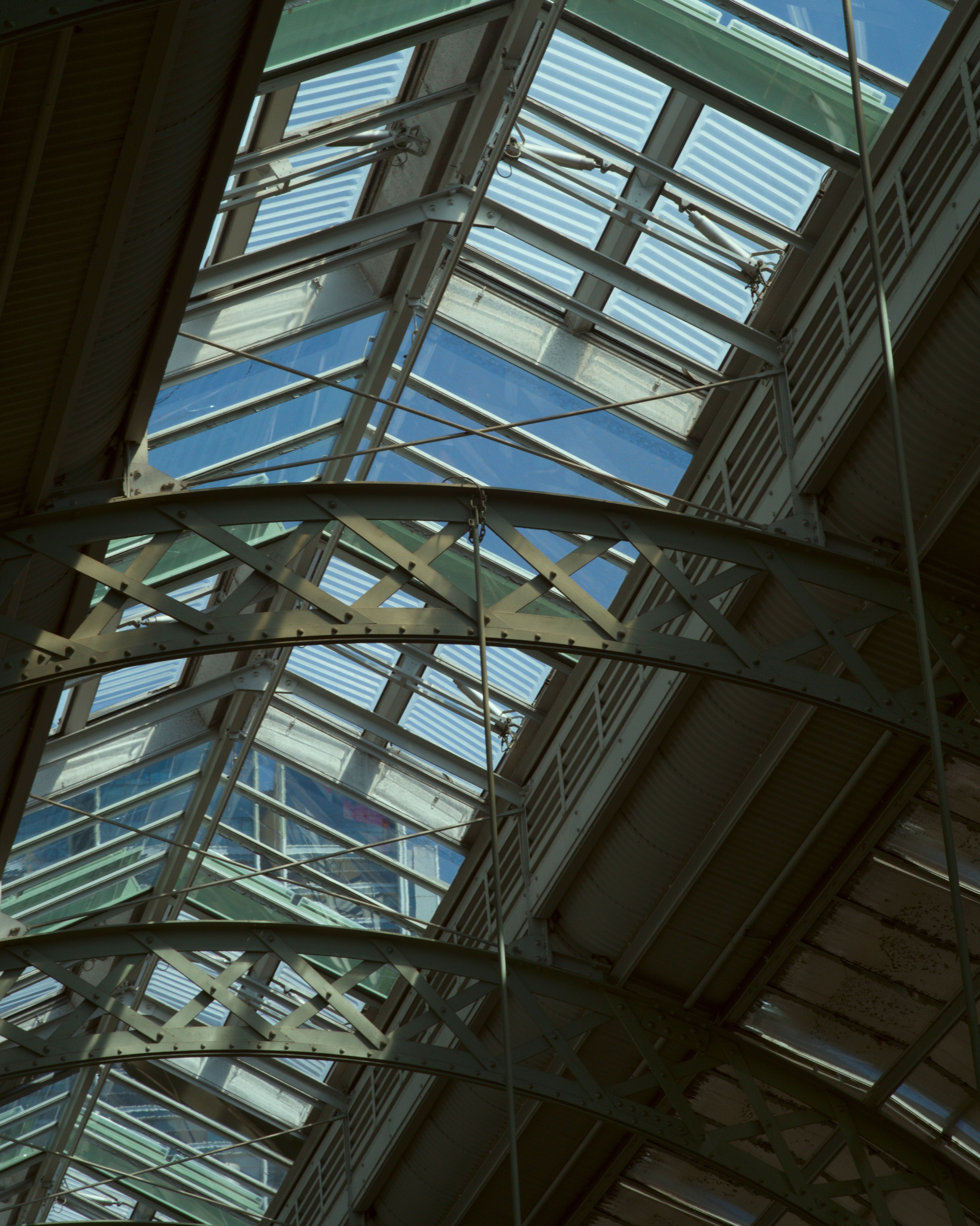

Imagine a painter. While they can seemingly mix tones on their palette ad infinitum, they are still working from a limited set of pigments. Those pigments act as a unifying base. The constraint is not a limitation of expression, rather it is the basis that allows colour to function coherently.
The world however, isn’t arranged with photographs in mind – especially if you’re a street photographer or working in urban-style environments. Surfaces are painted, replaced, weathered, and repaired without regard for how they relate to one another. Materials carry their own colour, then light shifts them further, altering warmth, contrast, and saturation.
This accumulation of colour can de-rail images very quickly, when there is just too much on offer. It introduces a kind of low-level noise, which is difficult to resolve after the fact without awareness and consideration in your handling. Even a well-composed frame can lose clarity when colour has overwhelmed its other ingredients. In artmaking, colour is not implicit; it requires the same level of attention in its resolution as any other element.
In practice, this means making decisions about what to include, what to combine, and what to exclude. Limiting colours facilitates repetition, where the same colour appears across different areas of the frame, or dominance, where a chosen colour carries most of the visual weight. At times, a single contrast can anchor the entire composition.
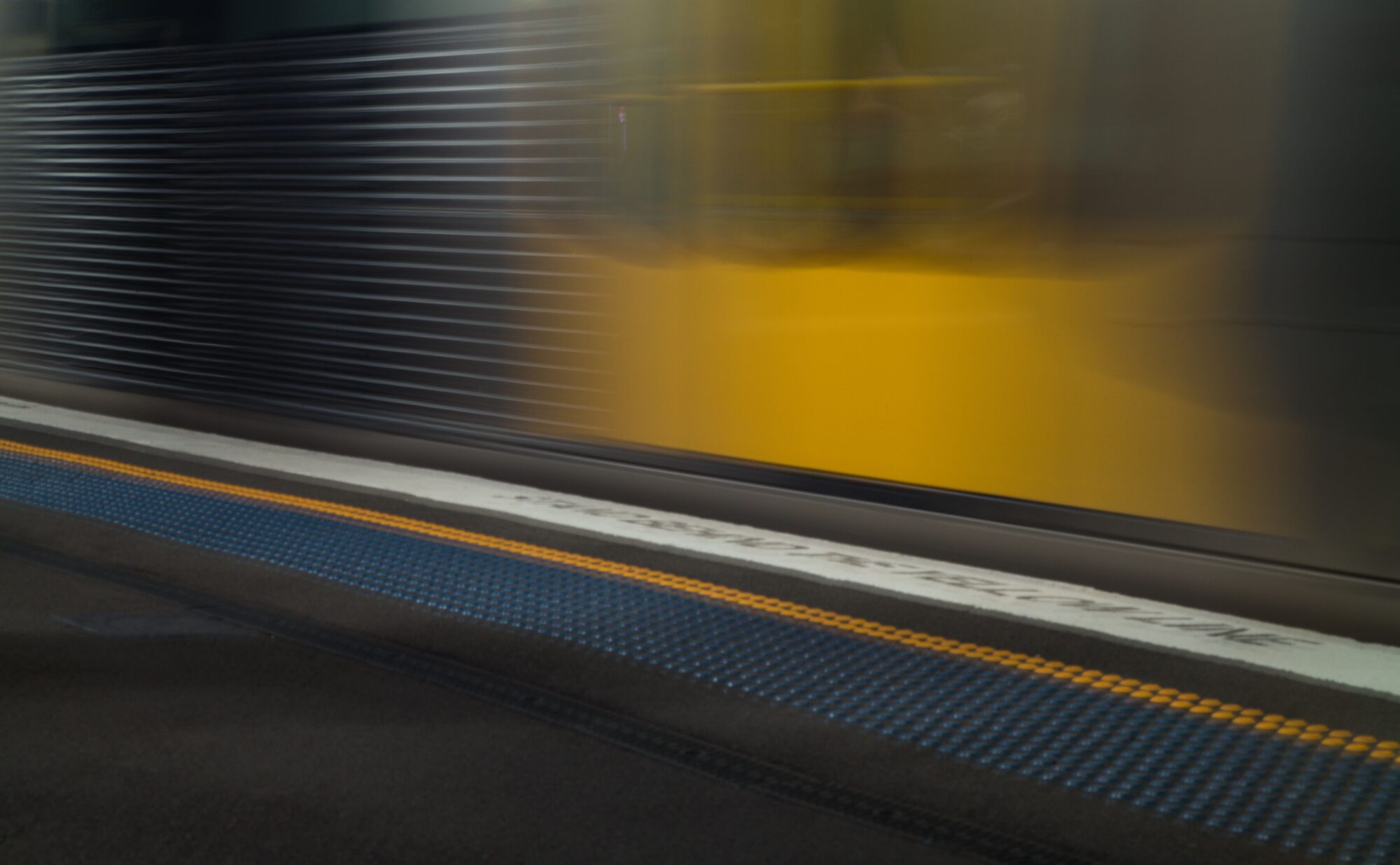
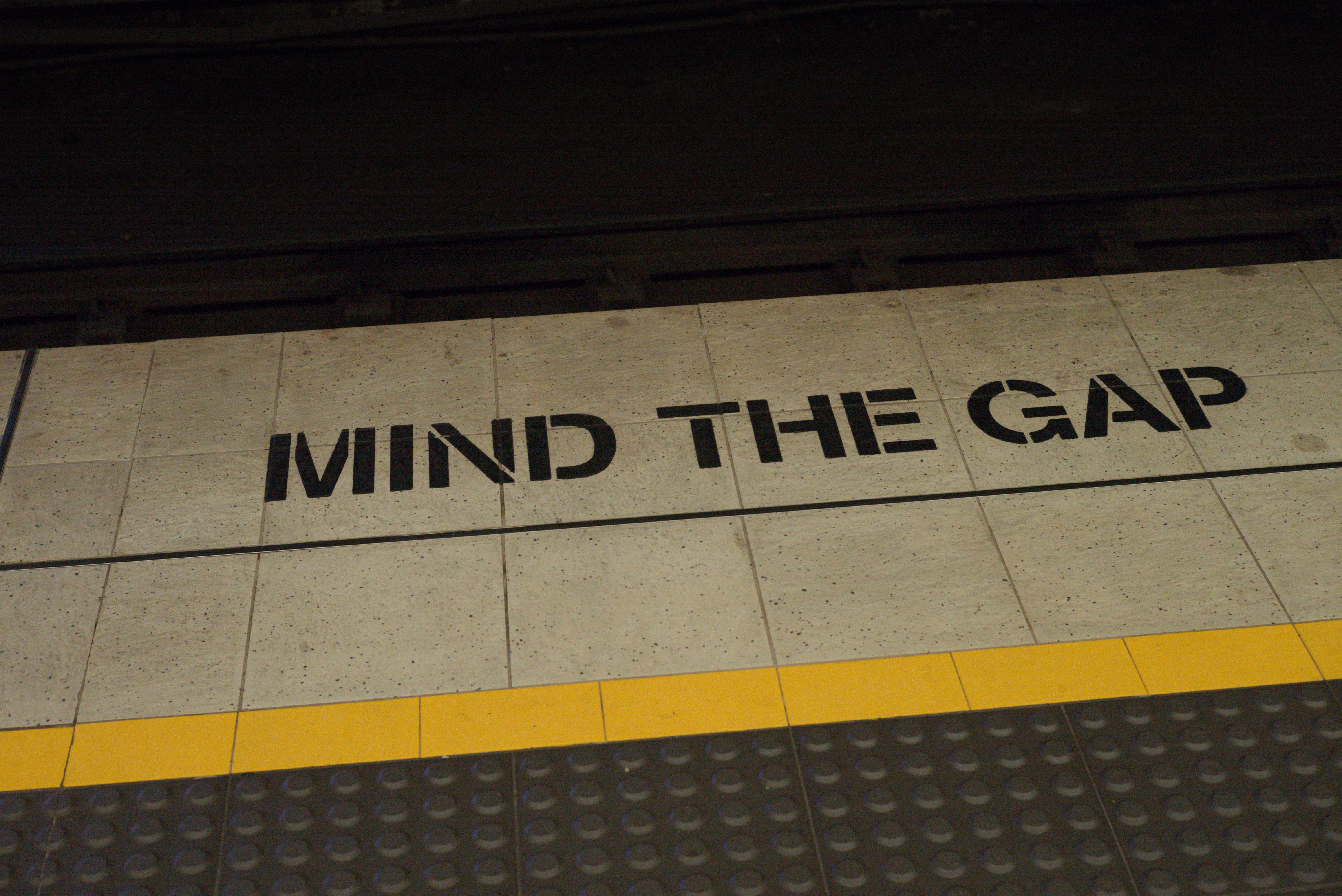

Colour is no longer having a competition with the frame. It now works with other elements to organise, rather than disrupt, the image. Adjustments made after the fact, need to be considered in a conscious and thoughtful manner. What holds a photograph together is not merely the presence of colour, but rather the way it is distributed.
In most situations, there will be more colour available than will actually be useful. The task, then, is not to simply find colour, but to recognise when there is finally little enough of it for the colours to be meaningful, and effective.
Leave a Reply