Understanding the elements and principles of design as a basis for all visual arts.
Before we get too mystical about “talent” or “creativity”, it’s worth saying this plainly: art is built. Not conjured. Not bestowed. Built out of a small, manageable set of visual ingredients that everyone already understands on some level. These elements and principles are the shared foundation beneath every visual art form, and learning to recognise them is the first step toward using them in a deliberate and meaningful way.
Line
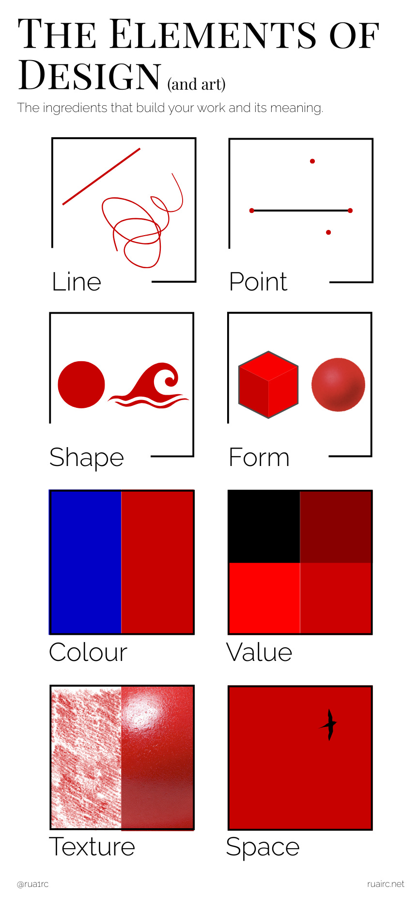
You don’t need me to explain what a line is. Even those who most strongly insist they are “creatively challenged” or even “un-artistic” are perfectly capable of both observing and creating a line. It’s at this point I say “Congratulations, you are an artist” – you’re using the elements of design.
Lines can be straight, curved, thick, thin, continuous, or broken. They define edges, indicate movement, divide space, and tell your eye where to go next.
A line can also do double duty, creating another element: a point.
Point
Often overlooked, a point is where it all begins. A dot. A mark.
Points attract attention immediately. They act as anchors, starting points, or destinations for the eye. In a field of visual information, a single point says “look here”.
In photography, this is often your focal point: the lone figure in a wide landscape, a catchlight in an eye, a bright window in an otherwise dark frame. Even when it isn’t literally a dot, it behaves like one – a small, concentrated area of visual weight that everything else gestures you toward.
Multiple points can suggest movement, rhythm, or connection, as the eye hops from one to the next. Every line, shape, or form starts with a point, and every strong composition gives the viewer at least one place to begin.
Shape
Welcome to kindergarten. You’ve undoubtedly conjured up in your mind the geometric circles, squares and triangles, but we’re also considering the irregular and organic types here too. Shapes are two-dimensional, enclosed areas formed by lines or changes in colour or value.
Shape has a huge influence on composition and structure. Now remember, when we use the term shape, we mean two-dimensional, unlike…
Form
Form is shape’s three-dimensional sibling. In sculpture and architecture, form exists physically in space; you can walk around it, bump into it.
In two-dimensional art, form is implied, with shading, perspective, overlap, and value changes to trick the eye into seeing depth and volume where there is none physically. It’s illusion, but undeniably convincing.
Colour
Red, green, blue, chartreuse, puce (everybody’s favourite!)… Colour includes hue, value (how light or dark it is – we’ll cover this properly in a moment), and saturation (how intense it is).
Colour communicates mood, emotion, symbolism, and cultural meaning faster than almost anything else. It can shout, whisper, or quietly set the tone. The interactions between colours, such as complementary, analogous, warm or cool colour schemes, play a huge role in harmony and contrast.
Value
Value is all about light and dark. Strip the colour away, and value is what’s left.
Strong value contrast creates drama, clarity, and emphasis. Subtle value shifts create atmosphere, realism, and depth. If something in an artwork doesn’t read properly, it’s usually a value problem, not a colour one.
From my time in an introductory undergraduate painting class, one thing that has stuck with me is this: if an image “works” in black and white, it will “work” in colour. (The main lesson here was actually photograph your work, then desaturate it, so you can see your use of value clearly and assess where you may need to make adjustments, for realism or creativity/balance/contrast etc.)
Texture
Texture describes how something feels, or how it looks like it might feel. Some textures are real and tactile, while others are purely visual, created through marks, shading, or pattern.
Texture adds richness and interest. It can make a flat surface feel alive, or a smooth object feel cold, heavy, or fragile. Even the absence of texture can be a deliberate, and powerful, choice.
Space
Space is the area everything lives in – around, between, and within forms and shapes. If you have any art or design experience, you are probably aware of “positive” space (usually the subject) and “negative” space (its surroundings).
Space helps organise information, create depth, and give the eye somewhere to rest. Crowded space can feel energetic or overwhelming, while open space can feel calm, isolated, or anticipatory. Effective use of space can be difficult to train, and often it’s best refined through looking, making, and adjusting, rather than attempting to adhere to strict “rules”.
If the elements of design are the ingredients, the principles are the cooking. You can own every spice in the cupboard, but without some idea of how they work together, dinner’s going to be… unpredictable. The principles of design don’t just make art look better – they make it readable.
Balance
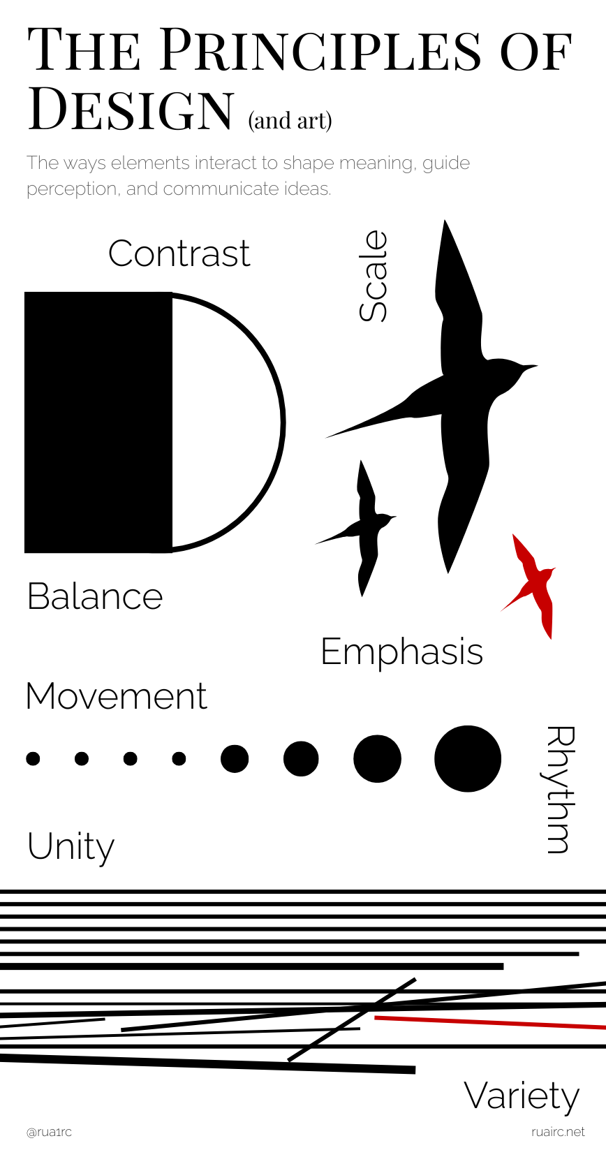
Balance is about how visual weight is distributed. That weight can come from size, colour, contrast, texture – not just symmetry. You can have a polite and orderly mirror-image balance, or asymmetrical balance, where things feel stable even though they don’t match. If it feels balanced, it probably is.
Contrast
Contrast is difference, plain and simple. Light against dark. Smooth next to rough. Loud colour beside the quiet. Contrast is what stops everything blending into one beige mush. It’s also one of the fastest ways to make something stand out and attract attention.
Emphasis
Emphasis answers the question: where am I supposed to look?
Artists create emphasis using contrast, scale, colour, isolation, or sometimes by simply leaving everything else alone. Not everything can be important; emphasis only works if something else is less so.
Movement
Movement is how your eye travels through an artwork. No actual motion required. Lines, repeated shapes, directional gestures, and gradual changes in value or colour all gently (or not so gently) nudge the viewer along. If your eye gets stuck in one corner and refuses to move, something’s gone wrong.
Rhythm
Rhythm comes from repetition, but not boredom. Think of pattern with variation – visual beats that keep going, changing just enough to stay interesting. Rhythm often works quietly in the background, doing a lot of heavy lifting without drawing attention to itself.
Proportion and Scale
This is about size and context. How big things are compared to each other, and compared to us. You can use realistic proportions, or throw them completely out the window. Both are valid. Scale is a powerful way to suggest importance, drama, or even humour.
Unity
Unity is what makes an artwork feel like one, not a bunch of unrelated ideas fighting for attention. Repeated colours, consistent mark-making and similar shapes all help tie things together. Unity is the glue.
Variety
Unity’s slightly chaotic sibling, variety is what prevents art from becoming dull. It’s the deliberate use of difference to keep things visually alive. Different lines, shapes, colours, textures, sizes, all working together rather than marching in perfect formation.
Variety works best when it’s controlled. Think of it as giving the viewer just enough change to stay interested, without making them work too hard. It supports emphasis, strengthens rhythm, and gives movement somewhere to go. Most importantly, variety reminds us that art shouldn’t be “perfect”, it should be effective.
The elements of design give us the vocabulary of visual art; the principles give us the grammar to make sense of it.
Now of course, mastery doesn’t come from memorising definitions, but from noticing how these things interact, how a line leads the eye, how value creates clarity, how balance can feel intuitive rather than mathematical. Whether you’re creating, teaching, photographing, or simply looking more carefully, understanding these foundations will sharpen your visual literacy and give you greater control over what you’re communicating.
Now go out and build art – deliberately, imperfectly, and with intention.
Leave a Reply